So I’ve been using the N9 for a few days now, and wanted to compare it to the N900 I normally use, the same way I compared the N900 and E71 before. So I’m going to go through the points of comparison from then and apply them here.
First off, boot time – the N900 wins here, by a good ten seconds, both in time from power-on to PIN entry and from power-on to able-to-make-a-call, with the N9 taking a good minute to get ready to call out.
Quality of the screen? The N9 wins here. Hands down, no contest whatsoever. The display is crisp and bright and vivid, and just a joy to work with. The N900 screen is by comparison drab and washed out, though the resolution isn’t awful in comparison.
The touchscreen, on the other hand, is an interesting comparison, and oddly, one that I think the N9 loses. It’s not that there’s a flaw in the touchscreen – it works at least as well as the iPad/iPhone/iPod touchscreens that I’ve used in the past – it’s just that for those of us whose fingers couldn’t be called “dainty” with a straight face, capacitative touchscreens are a clunky sort of thing at times.
Ease of use? Hm. Hard to call for me here because I’m so used to the N900. I think I’d have to give it to the N9 though – it might not be the easier of the two for me, but for anyone who’s not gotten used to the N900, the N9 has to be the easier to use of the two. Though I will say that the swipe features are sometimes a bit… finicky about what is a swipe and what’s not. But that’s a minor quibble at best. And it’s not like the N900 doesn’t have glitches either (I’m getting tired of the widgets vanishing from the screen, for a start), but I’ve not had the N9 long enough to see its glitches so that’s not a fair comparison to try to make. The UI on the N9 does seem much more responsive… when it correctly picks up your input, that is. The N900 is definitely slower, but I’ve not had it misinterpret a swipe or a poke at an onscreen button yet.
In terms of audio quality, it’s a very slight and hesitant win for the N9. Honestly, I don’t think the difference is very noticable, and it could easily be something random (like the actual line quality) but it felt like the N9 slightly edged it here. However, the N900’s audio is perfectly fine itself, so it’s a fairly academic point at best.
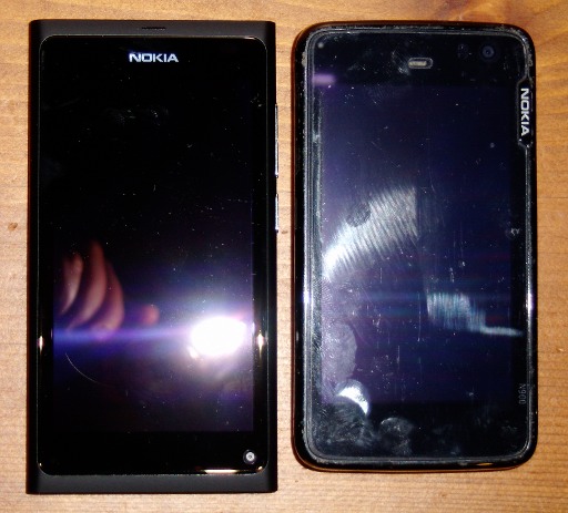
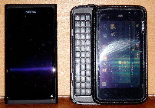
Physically, side by side, here they are:


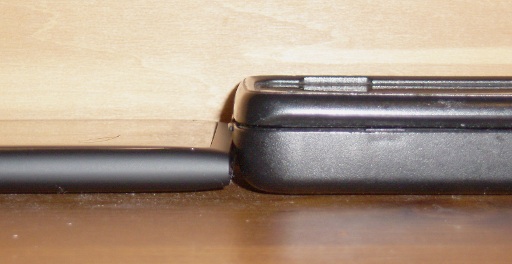
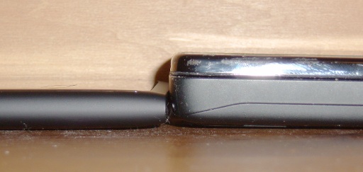
The thickness comparison isn’t really fair with the N900’s otterbox on though, so removing it:

So physically, they’re about the same footprint but radically different thicknesses, with the N900 twice as thick. However, for some reason, the N900 actually feels smaller in the hand (that footprint must be near the tipping point between “okay” and “big” for my hands I suppose).
I will say that the N900’s taken a year’s abuse or more, and even with an otterbox to protect most of it, it’s weathered it very well indeed. But I don’t think I’d feel comfortable using the N900 without a protective screen cover and something like the silicon case that it comes with (or an otterbox of some kind). Not when it’s selling for around the €600 mark. And that brings up a point I think is a design flaw with the N9 and it’s the camera:

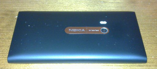
N9 Camera
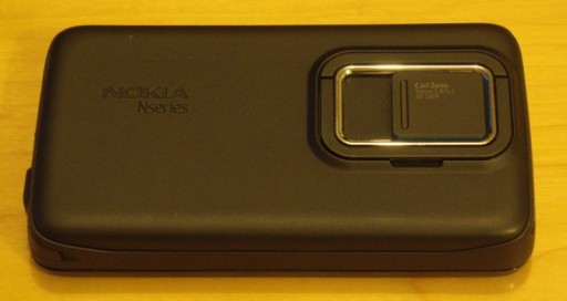
The lens for the camera is right there, exposed on the back continually. There’s no protection for it. One good scratch from your keys, and that camera is toast. Every image from then on will be ruined. To me, that’s a bad idea, and it’s one the N900 avoided with a lens cover:

That cover’s worked perfectly for the N900 for a year for me now. The lens on the camera is as good as the day it arrived and all that’s needed is an occasional dusting. Why they ditched a perfectly good feature like that, I don’t know. I will say though, that the actual camera software in the N9 is a massive improvement on the N900’s, which wasn’t all that bad to start with. Being able to select an off-center point for the autofocus by touch is very useful, the options screen is well-executed, and while I found the lock button not doubling as a shutter button to be annoying and daft, once you get used to the operation of the camera, it works really well.
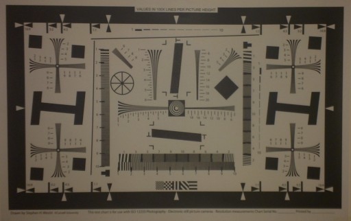
So, what about the camera’s image quality then? Well, it’s the N9 here I think, and not by a small margin:

N900 ISO 12233 test image

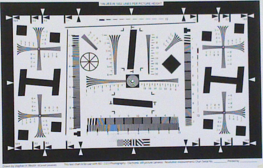
N9 ISO 12223 test image
Yes, the N9 looks darker (it was shot under artificial light while the N900 was shot in brighter natural light) – but look at the moire patterns in the bottom center and the crosses above and below the slanted H’s on either side – far more definition and resolution there. Click on the image to see the full size for comparison.
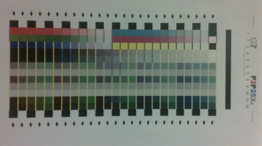
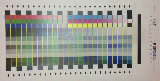
You can also see the colour reproduction is better:

N900 color test image

N9 color test image
Colors are just brighter and more vivid with the N9’s camera. That might be down to lighting for the test, but looking at sample images taken in the last week, it holds up:

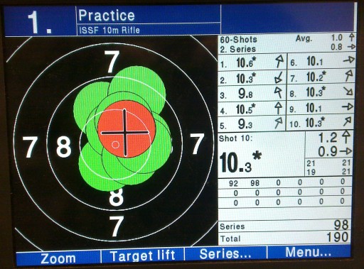
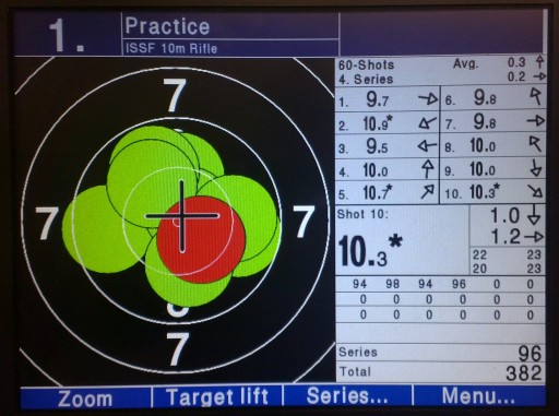
N900 Target image

N9 Target image
Compare the colours’ vividness and the lack of moire stripes in the N9’s image, and the N9’s the clear winner here. Also, what you can’t see is that the N9 can get the same quality of image without the moire effect kicking in from a lot closer to the screen than the N900, which is a lot more convenient. And in wider-field shots of non-emissive targets (ie. what you normally take photos of):

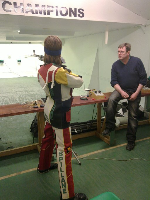
N900 portrait test

N9 portrait test
Even with the seriously demanding lighting challange the firing range always gives, the N9’s image just holds up better under examination.
So, which wins?
Well, for use as just a phone, the N9. Hands down. Easier to use, smaller, lighter, longer battery life (longest I’ve ever gotten from the N900 is 36 hours of idle – the N9’s already gotten past that with 40-odd hours), and slightly better audio (though that last one’s a very, very slight advantage at best).
For the camera, it’s the N9 by a country mile.
But as a smartphone/communications device, it’s a tie at best and it’s more likely that the N900 wins here. Even after a week, I can’t send a single SMS message on the N9’s on-screen keyboard with ease, and email is out of the question. And it’s not a question of more practice – onscreen keyboards really are just inferior to the real thing, so the N900’s physical keyboard – small and clunky though it may be – just wins. Not to mention that the resistive touchscreen, while definitely not as slick and pretty as the N9’s capacitative screen, is easier to use for us fat-fingered folk. And the N9’s browser, while good, isn’t as good as the N900’s default browser or Opera Mobile (which doesn’t seem to be available for the N9 and I’ve looked).
So would I trade in my N900 for an N9?
No. I’m too used to what the N900 lets me do, and my fingers don’t get on with the N9 – but (a) that’s me, not someone with normal-sized fingers, and (b) if I was still using the E71 or something similar, then hell yes, I’d trade them in for the N9. It’s a wonderfully polished end product that’s very usable for the average user, it does everything it says on the tin and more, and honestly, it’s a monumental kick in the crotch from Nokia’s engineering team to the Nokia management decision to drop the Maemo/Meego platform in favour of Microsoft’s Windows Phone.

N9 Target image
Like this:
Like Loading...
